You can find experts to build a mobile-friendly website through professional web design agencies, freelance platforms like Upwork or Fiverr, and trusted website builders that offer expert services. Choose a provider based on your budget, project needs, and the level of customization you want for your site.
If you’re wondering where to build a mobile-friendly website, the answer depends on your budget, goals, and preferred way of working. Whether you hire a professional agency, collaborate with freelancers, or use trusted website builders, what matters most is finding experts who can create a website that looks great and performs smoothly on every device. With the right team, you can have a site that loads fast, fits perfectly on any screen, and keeps visitors coming back for more.
Why Does Having a Mobile-Friendly Website Matters?
Before deciding where to find the right people, it helps to know why mobile-friendly design is essential. More than 60% of all online traffic now comes from smartphones. That means if your website isn’t optimized for mobile, visitors will leave quickly and you’ll miss out on valuable leads.
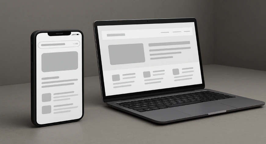
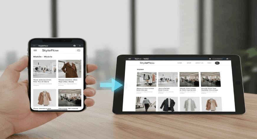
A mobile-friendly website adjusts automatically to fit different screen sizes, ensures readable text, and makes navigation effortless. Google also gives ranking preference to mobile-optimized websites, so having one helps your visibility too. In short, if your site isn’t mobile-ready, it’s like closing your doors to half your potential audience.
Option 1: Hire a Professional Web Development Agency
If you want an expert team to handle everything from design to launch, a web development agency is a great choice. These agencies usually have specialists for design, coding, testing, and SEO, ensuring your website performs perfectly across all devices.
They often use frameworks like Bootstrap or Tailwind CSS, which automatically adjust your layout to different screen sizes. Agencies also test websites on various mobile devices before launch to ensure everything — from buttons to forms works seamlessly.
While agencies might cost more upfront, they deliver long-term value by providing maintenance and post-launch support, saving you time and potential headaches later.
Also Read, Which is the Best Programming Language for Web Development?
Option 2: Hire Freelance Web Developers
If you have a limited budget but still want professional help, consider hiring freelance web developers. Websites like Upwork, Fiverr, and Toptal host skilled freelancers who specialize in responsive design and mobile optimization.
Here’s what to look for when hiring:
- Verified profiles with solid reviews.
- A strong portfolio of mobile-friendly websites.
- Experience with responsive frameworks (like Flexbox or CSS Grid).
- Familiarity with platforms such as WordPress or Shopify.
Once you shortlist developers, ask them to test your site on both Android and iOS devices to ensure consistency. Freelancers can be a great middle ground affordable yet capable of creating a professional-looking mobile-friendly website.
Option 3: Use Website Builders with Expert Support
Platforms like Wix, Squarespace, and Shopify make it simple to get started with pre-built, mobile-responsive templates. The best part? Many of these builders offer expert help through official partner programs.
For example:
- Wix Partners connect you with certified designers who specialize in mobile-first layouts.
- Shopify Experts can help set up and customize your online store for mobile shopping.
- Squarespace Circle includes professionals who tailor templates beyond the basics.
This option works best if you want control over your content but still want expert guidance for setup and styling.
Option 4: Connect with Local Web Design Experts
Sometimes, working with someone nearby makes the process smoother. Local web designers or small agencies can meet you in person, understand your brand better, and offer quick feedback loops.
You can find local experts through:
- Google Maps or local directories.
- LinkedIn searches and professional groups.
- Local networking events or startup communities.
The benefit? You get personalized attention and a website designed with your local audience in mind which can make your brand feel more authentic and relatable.
Option 5: Explore Mobile-First Web Development Companies
If your business depends heavily on mobile traffic say, an online store or food delivery platform consider working with mobile-first web development companies. These experts go beyond basic responsiveness and build sites that feel like native apps.
They often use technologies like:
- Accelerated Mobile Pages (AMP) for lightning-fast loading.
- Progressive Web Apps (PWAs) that function even without internet access.
- Lazy loading for faster browsing on mobile data.
This approach ensures a smoother, app-like experience that encourages longer visits and higher conversions.
Also Read, What is CSS in HTML and Its Types?
How to Pick the Right Expert for You?
Finding someone to help you build your dream website isn’t difficult, but finding the right expert who truly understands your goals, brand voice, and audience needs can make all the difference. Here’s a detailed look at how to choose wisely and ensure your investment brings real results:
1. Review Their Portfolio Thoroughly
A professional’s past work says a lot about what they can deliver. Go through their portfolio and check how their websites look and perform on different devices especially mobiles.
- Do the pages load quickly?
- Is the design simple, clean, and user-friendly?
- Are the colors, fonts, and layouts consistent with the brand’s identity?
For example, if you’re a boutique clothing brand, look for a designer who’s built fashion or retail websites before. It’s always easier to work with someone who understands your industry.
2. Ask About Their Process
A clear work process is a sign of professionalism. A reliable expert will explain how they plan, design, develop, test, and launch your website.
Ask them questions like:
- How long will it take to complete the project?
- What steps do they follow for testing mobile compatibility?
- Will they provide regular updates and revisions during development?
Someone who communicates openly and sets realistic timelines is more likely to deliver what you expect without unnecessary stress or surprises.
3. Check Their Technical Knowledge
Building a mobile-friendly website requires hands-on expertise with responsive frameworks and coding tools. Make sure the person or team you choose is comfortable with:
- HTML5, CSS3, and JavaScript for front-end design.
- Bootstrap, Tailwind, or Flexbox for responsive layouts.
- CMS platforms like WordPress, Shopify, or Wix for easier management.
- SEO basics to make your site rank better on search engines.
A technically sound developer ensures your website not only looks good but also performs well behind the scenes.
4. Prioritize Communication and Understanding
Even the best developers can struggle if there’s poor communication. Choose someone who listens carefully to your ideas and explains technical details in simple terms. If they’re patient with your questions, open to feedback, and clear about deliverables that’s a green flag. Remember, building a website is a collaborative process, not a one-sided task.
5. Compare Pricing Wisely
When you start getting quotes, you’ll notice prices can vary a lot. Don’t fall for the cheapest option immediately. Instead, compare what’s included in each package design, revisions, hosting setup, or after-launch support. Sometimes paying a little more can get you better reliability and fewer issues later. Aim for value, not just a lower price tag.
6. Look at Client Reviews and Testimonials
Real feedback from previous clients gives you a sense of what to expect. Check testimonials on their website, or browse platforms like Google Reviews, Clutch, or Upwork. Look for patterns if many people mention good communication, timely delivery, or strong mobile performance, that’s a great sign.
7. Ask About Post-Launch Support
A good website isn’t a “one-and-done” project. It needs updates, maintenance, and security checks from time to time. Ask your expert if they offer post-launch support whether it’s fixing bugs, updating content, or optimizing performance. Having reliable support means you can focus on running your business instead of worrying about technical glitches.
8. Gauge Their Creativity and Problem-Solving Skills
Beyond coding, website building requires creativity and adaptability. You might want a specific feature that’s tricky to design like an interactive product gallery or booking form. A good expert won’t just say “that’s not possible.” Instead, they’ll suggest smart alternatives or tools to achieve a similar result. That problem-solving mindset often separates an average developer from a great one.
9. Ensure They Understand Mobile User Behavior
Since your goal is to build a mobile-friendly website, the expert should know how users interact with content on smaller screens. They should design with thumb-friendly buttons, simplified menus, and minimal scrolling in mind. Ask them if they use real device testing or responsive preview tools ,it shows they take mobile usability seriously.
10. Trust Your Gut
Finally, after reviewing all technical and practical aspects, trust your instinct. You’ll likely be working closely with this person or team for weeks maybe months. Pick someone who feels reliable, confident, and genuinely interested in your business’s success.
Choosing the right expert isn’t just about skill ,it’s about partnership. The best fit will bring both technical expertise and creative understanding, ensuring your mobile-friendly website not only looks great but also delivers a smooth, enjoyable user experience.
Features You Should Expect in a Mobile-Friendly Website
No matter who you hire, your website should include essential mobile-optimized features such as:
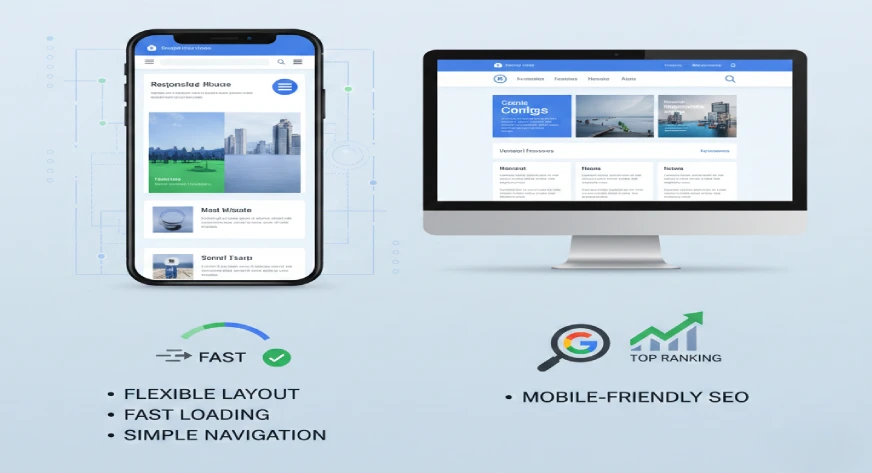
- Flexible layout design that adapts to all screen sizes.
- Readable text and clickable buttons that work smoothly on touchscreens.
- Fast-loading pages with optimized images and code.
- Simple navigation menus for quick browsing.
- Mobile-friendly SEO structure for better Google rankings.
For example, imagine running a café website where visitors can check your menu or order online. A well-optimized mobile site ensures they can do all of that easily, without zooming or waiting for pages to load.
Budget-Friendly Tip: Start Small, Scale Later
If money’s tight, begin with a minimal mobile-friendly website that covers essentials Home, About, Services, and Contact pages. Once it’s live and attracting visitors, you can expand by adding features like blogs, booking forms, or e-commerce functionality.
This phased approach keeps your budget manageable while ensuring you still have a responsive, professional online presence from day one.
Wrapping Up
You don’t need a massive budget or a big tech team to build a mobile-friendly website you just need the right experts who understand design, usability, and your business goals. Whether you choose a professional agency, a freelance developer, or a trusted local partner, what matters most is collaboration and clear communication. A well-built mobile website helps you connect with customers anywhere, anytime — and that’s what every business needs today.
If you’re looking for dependable professionals who can help you build a mobile-friendly website that’s both beautiful and functional, IT Solutions by Webworks Co. offers practical solutions tailored for small and medium businesses. Their focus is on clean design, responsive performance, and SEO-friendly structure everything your website needs to perform smoothly on all devices, without unnecessary costs or complexity.